Today we are in Prague, which we visited just before Christmas. My page captures a brewery that we visited, called Andělský Pivovar which was located in the Anděl (which means Angel) district.
For my page, I created a wood grain effect by colouring the background using some Tea Dye, Brushed Corduroy and Ground Espresso Distress Ink and then stamping a woodgrain effect stamp over the top. I added some thicker stripes of Dark Sepia Faber-Castell marker to create wood panels and then I covered the whole page with a layer of Liquitex matte gel medium. When fully dry, I drew the angel wings onto the page using a black marker. I recycled the beer mat and some images that I cut from their menu, arranging the pieces onto the page with some gingerbread stickers.
Andělský Pivovar is a restaurant and microbrewery that we found whilst exploring the Angel area.
They offer a range of lagers, IPAs, beers and stouts.
Andělský means Angelic, so here I am being angelic whilst enjoying my Gingerbread beer which they brew especially for Christmastime – it was so delicious! As T Stands for Tuesday, I’m also sharing our beers and wishing you all a very Happy T Day!
We had such a lovely time in Prague, it’s the perfect place to go if you celebrate Christmas; here we are enjoying the Anděl Christmas market – do you like my new hat? I always buy one from the markets when we visit Prague (smile).
I hope you are staying safe and well.
Thanks for joining me today! If you have any questions or comments, I would love to hear from you.
Challenges
I’m pleased to be able to join the following challenges today:
Art Journal Journey which is being hosted this month by the lovely Erika from BioArtGal; she has chosen It’s On The Calendar as her theme so I’m joining with my Prague page.
I had fun creating this page full of flowers using lots of different papers (smile!).
I started by applying a thin coat of Pébéo white gesso to the chipboard page and then I created a panel using some watercolour paper by smooshing some Peeled Paint, Twisted Citron and Rustic Wilderness Distress Inks onto it. When dry, I tore the edges of the paper panel and stuck it to the page using a glue stick.
Next I created the large flowers; I stamped the flowers onto three different pink design papers using a Flower Garden stamp set from Tim Holtz and black Archival Ink. Then I fussy cut them out and cut out some of the petals and stuck them together to create a single flower of patchwork petals. I also cut some smaller flowers from the pink papers using a Small Tattered Florals Thinlits set from Tim Holtz. Then I arranged them onto the page with some leaves that were die cut from two different green design papers using Wildflowers Stems #1 Thinlits set by Tim Holtz; everything was stuck in place using Liquitex matte gel medium. When dry, I coloured the centre of each of the flowers using a Yellow Promarker pen. To finish, I added the wording “so happy together” which was a Kaisercraft sticker.
I hope you’ll join us at Sparkles Monthly Challenge too, for more inspiration please check out the amazing Floral Frenzy designs from my Sparkles Buddies in the Design Team too; we would love for you to join us so please be sure to check out the rules here.
Like on my page, there’s a floral frenzy going on in my garden at the moment – I love this time of year as all the plants are flowering so beautifully (smile!). This is a glimpse at some the flowers in our garden at the moment – top left is Aquilegia or Ladies Bonnet, top right is Armeria Maritima or Thrift and bottom left is Tulip.
I hope that you are staying safe and well!
Thanks for joining me today! If you have any questions or comments, I would love to hear from you.
It was fun creating this polar bear Christmas card and I used some of my favourite die cuts and techniques to create this snowy wonderland. It looked so cold that I dressed the polar bear in a red scarf to keep him warm (grin!).
I started by creating a master board for the background by applying a thick layer of Navy, Swedish Blue and white acrylic paints onto a piece of mixed media paper and then placing some scrunched up cling film (plastic food wrap) over the top. I moved the cling film around to disperse the paints and then I left it to dry. When I peeled the cling film off it left some wonderful patterns and texture which formed my snowy winter wonderland background. I used a Snowflake stencil from Ranger to stencil some snowflakes over the master board using Platinum Planet Brilliance Ink too.
Next I cut a panel from the master board to fit the greetings card. Then I cut some snowflakes from white tissue paper using a Tonic Studios die cut set and stuck them onto the card using Liquitex matte gel medium. I love how the tissue paper and gel medium made the snowflakes look transparent.
The polar bear was created using a Theodore Thinlits set from Tim Holtz which is one of my favourites. The pieces were cut from white card stock, white and cream linen textured card stock and black card stock, edged with a Cold Grey Faber-Castell marker and then layered together. His ears were coloured with a Putty Promarker and I created his scarf using a piece of red felt. To finish, I added some silver glitter stickers which reads “Let it snow”.
This card reminded me of this beautiful little polar bear Christmas decoration which also lights up and changes colour (grin!).
I hope that you’re all stay safe and well!
Thanks for joining me today! If you have any questions or comments, I would love to hear from you.
Here is a list of all the materials used to create this card:
Daler-Rowney Mixed Media Paper
Liquitex Artist Color Acrylic (Navy, Swedish Blue)
Art Discount Acrylic (White)
Cling film
Ranger Dylusions by Dyan Reaveley Stencil (Snowflake – Large DYS63742)
Tsukineko Brilliance Ink (Platinum Planet)
White Tissue Paper
Tonic Studios Christmas Trio Die Set (Falling Snowflakes 1792e)
I’m glad I found out about Challenge Blogs, as they provide me with inspiration and are a wonderful way to meet like-minded arty people. So here are the challenges I’m joining today:
I’m pleased to join LTSCB #140 – Winter Wonderland challenge over at the Love To Scrap Challenge Blog with my polar bear walking in his snowy winter wonderland.
I’m joining in the fun over at Country View Challenges and their Anything Christmas challenge with my polar bear Christmas card.
I’m happy to join the # 119 Non-Traditional Christmas Colours challenge over at Sparkles Christmas Challenge with the blues, white and red colours that I used to create this polar bear card too.
As I used a couple of my favourite techniques to create the snowy background for this card, I’m also pleased to join the Favourite Technique challenge over at Simon Say Stamp Monday Challenge Blog.
I’m also pleased to join the Merry Little Christmas Challenge and their MLCCB #28 – December Anything Christmas Goes with my fun polar bear Christmas card too.
I’m also joining Paperbabe Stamps and their #134 – Anything Goes challenge with my Christmas card.
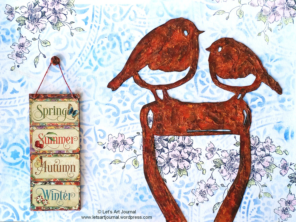
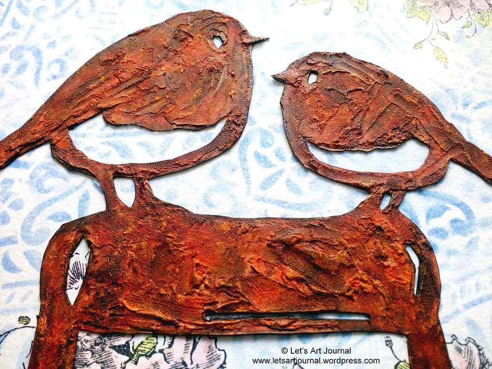
My sister kindly bought me a beautiful rusty style robin garden decoration, as you may know I love robins and it really makes my day when I see them in our garden so this was the perfect gift. I wanted to capture it along with the words she wrote on the note that she gave me with this gift which reads “now you can have robins in your garden all the time” (grin!).
For the background I stamped the pink blossoms using black Archival Ink and a blossom stamp from Stampendous; they are painted using Twisted Citron Distress Ink for the leaves and a mixture of Fired Brick Distress Ink and White Linen Dylusions Ink Spray for the flowers with additional touches of Putty colour from a Winsor & Newton Promarker. I applied Blueprint Sketch Distress Ink using a blending tool through a doily stencil randomly around the flowers then I spritzed the stenciling with water to re-activate the ink to give a washed out effect.
For the robins, I drew around my robin garden decoration using a pencil onto some mixed media paper and then spread Ranger Texture Paste in-between the drawn lines using a palette knife to create the rust texture. Once dry, I gradually coloured the texture paste to build up the rust effect using quite a few layers of Sanguine and Dark Sepia Faber-Castell Big Brush markers and Rusty Hinge Distress Ink. Next I cut the robins out of the mixed media paper and I applied some Orange Soda and Mango Faber-Castell Gelatos by scraping them over the raised areas of texture paste and smudging the colour with my finger which finished the rust effect wonderfully.
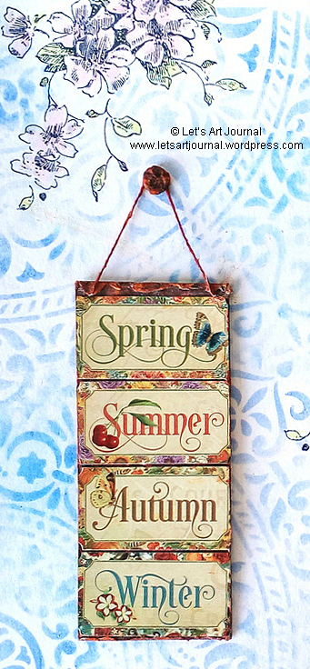
For the sign, I cut a piece of white cardstock to size and stuck the message that my sister had written on one side of the card. I coloured the other side using a Sanguine and Dark Sepia Faber-Castell Big Brush marker and attached the four seasons stickers from Graphic 45 over the top. I then framed the front and the back edges with texture paste using a palette knife and I also used the texture paste to cover a brad too. When dry, I add a piece of cotton string to the sign and then coloured both the string and the texture paste using the Sanguine and Dark Sepia markers and then the Orange Soda and Mango Gelatos to create a rusty effect.
Next I attached the sign by the string to the page using the brad; this allows it to be turned over to reveal the message from my sister which reads “now you can have robins in your garden all the time!!”; which is why I chose to list all the seasons on the other side (grin!).
The robins look so pretty in my garden; I have placed them just outside my kitchen window so I can see them all the time and as you can see they are so beautifully rusty – perfect!
I hope that you are all staying safe and well!
Thanks for joining me today! If you have any questions or comments, I would love to hear from you.
Challenges
With rusty texture that I created, I’m pleased to join the Texture challenge over at Art Journal Journey that I’m hosting this month; thanks to everyone who has joined so far!
I’m so happy to join the Staying In The Background challenge over at the The Funkie Junkie Boutique Challenge Blog with the pretty stamped and stenciled background that I created on this page.
I’m also happy to be able to join the #128 – Dimensions challenge over at Paperbabe Stamps with the rusty elements and signage dimension on my page.
I’m joining the Complimentary Colours challenge over at Country View Challenges with the blue background and rusty orange of the robins.
I’m also joining the Favourite Stencil (and why) challenge over at the As You Like It Challenge with my stencilled background; I love the pretty doily pattern that this stencil creates as it looks so delicate, this stencil is also versatile as it can be joined together to create one whole doily or just used randomly as I did on this page.
Here is a list of all the scrap materials used to create this art journal page:
I am so delighted to be hosting Art Journal Journey this month and the challenge theme that I have chosen for this month is Texture.
We would like you to have fun creating texture on your pages. As you can see from the different panels on my page there are lots of possibilities to create texture. This could be by adding texture paste, crackle paste, high density mediums like gesso, paints or embossing powder. You could also use embossing folders, layers of papers, die cuts, fabrics or chipboard pieces too. The choice is yours!
I couldn’t just choose one texture so I decided to create my page using 21 different texture panels to inspire you and as I started creating the panels they turned into little scenes, I hope you like them (grin!).
If you’re interested, here’s close up pictures and full details of how the panels that make up my page were created. There’s also a list of all materials I used at the end of this post too.
1. Foil For my first panel, I stamped a dragonfly using black Archival Ink onto some coloured foil, which is recycled from an Easter egg wrapper. I stuck it onto the panel using a glue stick and to create the worn textured look I added some black Archival Ink to emphasis the creases and then I rubbed the foil back to its base silver colour with a baby wipe. To finish I added the glittery flower.
2. Teabags & staples Using staples I attached a used teabag to the panel and then I stuck three teacups on the top which were die cut from some design paper.
3. Glass beads I coloured the panel with some Summer Sky Memento Ink and then applied Liquitex Glass Beads Texture Gel over the top with a palette knife. Whilst the medium was still wet I pressed some pretty blue glass beads into the texture gel. When dry I added the little orange fish which is a brad.
4. Dried leaves I used matte gel medium to layer together a yellow skeleton leaf, a dried beech leaf and a die cut flower, which was cut from some linen textured paper using a Wildflower Tim Holtz Thinlet.
5. Fabric, threads and lace The panel was covered with some self-adhesive fabric and layered with a piece of frayed muslin, some Hessian/burlap and some threads which I topped with a lace flower.
6. Corrugated card I added a piece of corrugated card, which was recycled from some packaging, using matte gel medium then applied some Pébéo white gesso over the top. When dry, I emphasised the corrugations using a Dark Sepia Faber-Castell Big Brush marker. The postage stamp is from Graphic 45 and was distressed using the Dark Sepia marker, Tea Dye Distress Ink and black acrylic paint.
7. Elastic bands I applied some matte gel medium to the panel and sprinkled on some Orthodontic elastic bands that CJ kindly set to me (grin!). When dry I covered them with white gesso and highlighted the circles using a Dark Sepia marker. Then I edged the panel using Vintage Photo Distress Ink and coloured some of the circle centres using Tumbled Glass Distress Ink. To finish, I added three little hearts that were in my craft stash; they were created using the Falling Hearts Thinlet set from Tim Holtz and glossy white cardstock.
8. Crackle I covered the panel with white gesso and when it was dry I applied Earl Grey, Caramel and Coconut Faber-Castell Gelatos smudging the colours with my finger. To create the crackle I used a BoBunny stamp and some Toffee Crisp and Rich Cocoa Momento inks and Black Archival ink.
All the letters for the “texture” wording were created using an X-Cut die set; they were cut from both black and white paper and then layered together onto a panel of textured design paper.
9. Glitter I cut some different coloured glitter sheets into squares and then stuck them onto the panel using a glue stick.
10. Cork I simply stuck a piece of cork designed paper onto the panel.
11. Paint Splatter To add more texture I used some high density Liquitex paint, splattering Vivid Lime Green, Cold Grey and Bright Aqua Green onto the panel and leaving it to dry.
12. Wood This is one of my favourite techniques; I applied Tea Dye, Brushed Corduroy and Ground Espresso Distress Ink pads vertically down the panel and used a paint brush to add some matte gel medium over the top keeping the brush strokes in a vertical direction. I repeated the process a couple of times making sure each layer dried before adding the next.
13. Texture paste I applied some Ranger Texture Paste to the panel using a Vintage Diamond stencil. When dry I coloured the panel using Salty Ocean and Cracked Pistachio Distress Inks, then emphasised the texture paste using some Midnight Sparkle lustre wax.
14. Napkin I simply covered the panel with a gold embossed napkin using a glue stick.
15. Wooden chipboard pieces and rust effect I started by sticking the cogs in place using matte gel medium. When dry I added layers of different shades of rust and brown acrylic paints which I had created by mixing Cadmium Red, Cadmium Yellow and black acrylic paints. When dry I added more detail using Dark Sepia and a Sanguine Faber-Castell Big Brush marker. Then I added some patina by lightly stippling some Bright Aqua Green acrylic paint over the top.
16. Paper layers I covered the panel with leftover paper pieces and edged them using a black Uni Pin marker. The flower is a paper sticker and the foliage was cut using a Funky Floral Thinlet from Tim Holtz and coloured using two green Winsor & Newton Promarkers.
17. Doily and gems I added lots of texture to the panel using layers of doily which I edged with Vintage Photo Distress Ink and a Dark Sepia marker. They are stuck in place using double-sided tape and then embellished with some textured gemstones to add some shimmer and shine.
18. Embossing Folder, thread and buttons I used an embossing folder to add a flower design to a piece of Kraft cardstock and then coloured the raised embossed design using a white Uniball gel pen and Aqua Green Promarker. Then I wound some wax thread around the panel and attached a big button.
19. Drywall/Plasterboard Tape I added some drywall/plasterboard tape to the panel and coloured it using Tumbled Glass Distress Ink and White Linen Dylusions Ink Spray. I splattered the panel with black DecoArt acrylic paint and added some washi tape to create the foreground. Then I added the mushrooms which are from the Field Notes Ephemera Set from Tim Holtz.
20. Embossing enamel and die cut trellis The panel background was coloured using Tea Dye and Antique Linen Distress Ink and Dandelion and Pistachio Memento Ink. The trellis was die cut from white cardstock covered in black Archival Ink and Chunky Silver Stampendous embossing enamel. I added two little birds which were stamped using black Archival Ink, coloured with Promarkers and fussy cut out.
21. Tissue Paper For the final panel, I crumpled some white tissue paper and then added it to the panel using matte gel medium. When dry, I coloured it with Lemon, Cadmium Yellow, Cerulean Blue, Yellow Ochre, Burnt Sienna watercolour paint. The flower was cut from some Kanban cardstock using a Wildflower Tim Holtz Thinlet.
Once the panels were complete I stuck them onto the page using double-sided tape; I coloured the background with a Dark Sepia Faber-Castell Big Brush marker to outline the panels before sticking them in place.
Do you have a favourite panel? It’s hard for me to choose, maybe number 3 with the beads and little fish, number 6 as I love the corrugated card, number 15 with cogs and rust or number 20 as you know I adore robins (grin!).
I hope that you are inspired to join us at Art Journal Journey this month too! We are really looking forward to visiting you and seeing all the Texture that you create on your pages (grin!).
Hoping that you’re all staying safe and well! x
Thanks for joining me today! If you have any questions or comments, I would love to hear from you.
Challenges
I’m joining the It’s A Wrap challenge over at the The Funkie Junkie Boutique Challenge Blog with the Easter Egg wrapping, corrugated packaging and tissue paper wrap I used to create my panels.
I’m happy to be able to join the Anything Goes challenge over at Paperbabe Stamps with my page.
I’m so pleased and honoured to be Guest Designer over at Country View Challenges for their I do like to be beside the seaside challenge this month.
This challenge is very fitting as I live by the sea so I decided to transport this adorable bear in his homemade Hawaiian shirt to a seaside scene inspired by where I live (grin!).
I started by covering the foreground with Ranger Texture paste to create a sandy texture. When dry I coloured it with Scattered Straw, Mustard Seed and Tea Dye Distress Inks. Then I coloured the sky using Salty Ocean Distress Ink by stamping the ink pad onto an acrylic block, spritzing with water and pressing the block onto the page. Whilst the ink was wet I also added some Mermaid Lagoon Distress Ink onto an acrylic block and pressed the block lightly onto the sky background to create the cloud effect. The sun was created using Ranger Texture Paste by applying it through a Mosaic stencil from Tim Holtz. When the texture paste was dry, I coloured it with a Canary Winsor & Newton Promarker. For the sea, I drew a straight horizon using a ruler and then coloured the sea using the Salty Ocean Distress Ink; applying it like watercolour.
The sea foam was created by applying some Pébéo white gesso and then some Liquitex Glass Bead Texture Gel over the top. I used a Funky Floral Tim Holtz Thinlet set to create the grasses from some recycled note paper that I had coloured using Mowed Lawn and Pine Needles Distress Ink and a Soft Green Winsor & Newton Promarker.
I created the bear using the Theodore Thinlet set from Tim Holtz; he was cut out of some linen textured cardstock and coloured using Ground Espresso, Tea Dye, Vintage Photo and Hickory Smoke Distress Ink, a Black Faber-Castell Big Brush Marker for his nose, eyes and eyebrows and a Putty Winsor & Newton Promarker for his ears. I hand drew the shirt and then cut it out from some design paper, re-adjusting the arm so that he was holding the ice cream which is a sticker – such fun!
The wording is cut from black paper using an Alphanumeric Label Thinlet set from Tim Holtz and to finish, I added three seagulls which were die cut from white cardstock and coloured using Cold Grey and Black Faber-Castell markers.
For more inspiration please check out the amazing creations from the Design Team over at Country View Challenges – I hope that you are inspired by this month’s I do like to live beside the seaside challenge too and are able to join in the fun!
I feel very blessed to live by the sea, here is the view overlooking the sand dunes …
… and this is our beautiful beach with the pier in the background.
As my hubby will tell you it’s essential to have an ice cream whilst at the seaside and here are a couple of our favourite flavours – Double Chocolate and Sticky Toffee Pudding (grin!).
I have really enjoyed spending time with you today and I’d like to say a special thank you to Country View Challenges for giving me the opportunity to design for them!
Thanks so much! If you have any questions or comments, I would love to hear from you.
Today over at A Vintage Journey it’s Tag Friday, there is no particular theme as it’s all about creating something you love, experimenting and having fun! I hope that you will join our tag challenge, it would be lovely to see you there!
Spending more time in my garden means that my art is being inspired by some of the beautiful flowers which are blooming at the moment, so today’s double-sided tag features purple poppies and rudbeckia.
The tag itself was made from a large Poster Card by Tim Holtz and I added some texture and colour to the edges of it by applying some Broken China Distress Embossing Glaze and then some Rusty Hinge Distress Ink. As I planned to use Faber-Castell Gelatos on both tags, I applied some white gesso to the tag first; this enhanced the colours and made it easier to apply the Gelatos. When the gesso was dry, I scribbled Kiwi and Aqua Dolce Faber-Castell Gelatos over the top smudging the colour with my finger.
Next I removed some of the Gelato colours using a baby wipe through a Halftone stencil from Tim Holtz and I used the stencil again to add some Memento Inks; I used Cottage Ivy ink for the poppy background and Paris Dusk ink for the rudbeckia background.
I stamped a document stamp and a grunge stamp from two different Tim Holtz stamp sets using black Archival Ink and then some leaf stamps from Carabelle Studios using Cottage Ivy Memento Ink for the poppy tag and London Fog Memento Ink for the rudbeckia tag. To finish the backgrounds, I added some rub-on transfers from a Specimen Remnant Rubs set by Tim Holtz.
The flowers were stamped onto some Mixed Media paper using a Stamping Platform to ensure a clear crisp finish. The stamps are from a Flower Garden stamp set by Tim Holtz and are stamped using black Archival Ink. The foliage was coloured using Sap Green Kuretake watercolour paint and highlighted using Lime Green and Forest Green Winsor & Newton Promarkers.
I had fun painting the poppy using Colbalt Violet, Black and White Kuretake watercolour paints and I coloured the edges of the petals using Amethyst Winsor & Newton Promarker. I used Lime Green and Canary Promarkers to colour the centre of the flower and a white Uniball gel pen, a black Uni Pin marker and a Cool Grey Promarker for the stamens. The flower was stuck in place using a glue stick and some glue dots and I added the “Create Art” wording which was a Quote Chip from Tim Holtz that was edged using a black Faber-Castell Big Brush marker.
The rudbeckia flower was painted using Lemon Yellow, Cadmium Scarlet, Black, White and Burnt Umber Sienna Kuretake watercolour paints and a Canary Promarker. I used a black Uni Posca paint pen and a black Uni Pin marker to add the texture to the stamens. I added the “Be Brave” wording and edged both tags using a black Faber-Castell Big Brush marker. To finish, I added an eyelet with my Crop-A-Dile machine to reinforce the hole as I’m using a book ring to secure all of my double-sided tags together as part of my Tag Journal (grin!).
For more Tag Friday inspiration, please pop over to A Vintage Journey where you’ll find some fabulous tags created by my fellow Creative Guides. I hope you are inspired to join us as I’m so looking forward to seeing your tag designs!
These purple poppies are a welcome addition to our flower bed and were totally unplanned; I think the birds must have brought them into the garden (grin!). They have been flowering non-stop since the beginning of July. I’m featuring them again as some of you had never seen them before so I thought I’d share some more information about them:
This particular poppy is called Papaver Somniferum “Hungarian Blue” and is an heirloom variety with single flowers.
They are gorgeous purple-violet shades with dark inner markings on each petal.
They are easy to grow being ideal as a cut flower and the dried seed pods can also be used in flower arranging.
They grow to a height of 90cm.
The rudbeckia has just started flowering and adds a happy vibrant yellow to our flower bed; this particular one is Rudbeckia Fulgida ”Goldsturm” and is also known as the Golden Cone Flower or Black Eyed Susan.
I hope that you are staying safe and well!
Thanks for joining me today! If you have any questions or comments, I would love to hear from you.
Challenges
I’m pleased to join the Summer challenge over at Paperbabe Stamps with my summer flower tags.
I’m joining in the fun at Country View Challenges and their Do What Makes You Happy Challenge with my flower tags as although I always find making tags a bit daunting I always enjoy making them; they also make me smile when I look at them as they are always on display in my craft room.
I was so happy to have won some new products from one of the challenges over at Paperbabe Stamps I created this pretty page to remind me of some huge purple poppies that are in our garden – see what you think!
I started by painting some Leaf Green and Watering Can Wendy Vicchi Blendable Dye Inks onto the page by applying the ink to a blending mat, spritzing with water and using a paintbrush. Next I applied some of the Leaf Green ink through a Herringbone stencil from Paperbabe Stamps and splattered the page with both the Leaf Green and Watering Can inks. The flowers are an Inkylicious Oriental Poppy stamp and were stamped onto a piece of mixed media paper with black Archival Ink using a stamping platform to get a clear and crisp image.
I coloured the petals using Seedless Grape Distress Ink, shading the colours by painting the ink onto the flowers. As they looked a bit pink I also applied some Lulu Lavender Memento Ink over the petals. For the stamens, I added more detail using a black Uni Pin marker and a white Uniball gel pen, then I coloured them using Lime Green, Canary, Amethyst and Cool Grey Winsor & Newton Promarkers. I fussy cut the flowers out, which took quite a bit of time and stuck them onto the page using a glue stick. The stars are from the Flourish & Grow Paperbabe Stamps and are stamped using Seedless Grape Distress Ink. I used the same stamp set for the wording using black Archival Ink, the words read “Flourish”, “love” and “Dream”. To finish I splattered the page with black DecoArt acrylic paint.
Here are my new Paperbabe Stamps goodies, I’m looking forward to using the other items soon (grin!).
These are the poppies that inspired the flowers on my page, I think the birds must have brought them into the garden – yay!
Hoping that you are all staying safe and well! x
Thanks for joining me today! If you have any questions or comments, I would love to hear from you.
Challenges
I’m glad I found out about Challenge Blogs as I enjoy taking part, they provide me with inspiration for my pages and are a wonderful way to meet like-minded arty people. So here are the challenges I’m joining today:
I’m pleased to join the lovely Halle from Halle’s Hobbies over at Art Journal Journey and her A Stitch In Time challenge this month with the herringbone pattern on this page which is often associated with fabrics.
I’m joining in Simon Says Stamp Monday Challenge and their Shoot For The Stars challenge with the stars that I added to my art journal page.
This month over at A Vintage Journey our challenge is Rustic Charm, which is being hosted by the lovely Astrid. Here’s what it’s all about:
“Rustic describes a design that is natural, rough, aged and casual. We would love to see you create a project using these elements: think nature inspired textures and simple and earthy colours. Just remember to create your project in one of our preferred styles: vintage, shabby, mixed media, art journaling, industrial, timeworn or Steampunk”.
I had so much fun creating this rustic art journal page for this challenge. I thoroughly enjoyed making the wood effect background and this happy bear from my new Tim Holtz Theodore thinlet set really makes me smile!
I started by covering the page with blobs of Burnt Umber, Raw Umber and Burnt Sienna Liquitex acrylic paints and then I used an old gift card to spread the paint over the page in a criss-cross pattern. Any white spaces were lightly coloured with the same paint and a wet paintbrush, then the page was left it to dry.
Next I stencilled some tree trunks using some Ranger Texture Paste and a Pronty Mask Stencil.
When dry, I painted around the stencilled areas of the background with some Parchment Liquitex Acrylic.
Then I scraped the paint horizontally across the page very harshly using the gift card; I did this a number of times until I achieved the worn wood effect I was after. The mixed media paper I use is 250gsm so it can take this type of treatment.
The branches, leaves and flowers were die cut from some linen textured cardstock using a Tattered Florals Thinlet set from Tim Holtz; the branches were coloured using Ground Espresso Distress Ink, the leaves using Mowed Lawn, Shabby Shutters and Forest Moss Distress Ink, and the flowers using a mixture of Fired Brick Distress Ink and White Linen Distress Spray. They are edged, like all of the elements on this page, using Vintage Photo Distress Ink and stuck down using a Zig glue pen.
The signpost was made from some wooden panels that I cut out from some Tim Holtz paper and some wording from a Tiny Text rub-on transfers from Tim Holtz which reads “wander”, “adventure awaits” and “discover”. I added some grey tartan (plaid) paper from the same paper pad to define the ground under the signpost and the bear.
To finish, I created the bear using the Theodore thinlet set and some linen textured cardstock colouring him using Ground Espresso, Tea Dye, Vintage Photo and Hickory Smoke Distress Ink, a Black Faber-Castell Big Brush Marker and a Putty Winsor & Newton Promarker – such fun!
I hope you are inspired to join in the Rustic Charm challenge over at A Vintage Journey too, for more inspiration you’ll find some amazing creations from my fellow Creative Guides over at A Vintage Journey, it would be lovely to see you there!
This page reminded me of a bear that we saw on our travels to Stratford-upon- Avon some years ago when our friends from America came to stay with us.
This bear can also be found on this beer glass and always brings back such happy memories of our time when we were in Stratford together – such fun!
Thanks for joining me today! If you have any questions or comments, I would love to hear from you.
Challenges
I’m glad I found out about Challenge Blogs, like A Vintage Journey, as I enjoy taking part, they provide me with inspiration for my pages and are a wonderful way to meet like-minded arty people. So here are the challenges I’m joining today:
I’m pleased to join the lovely Halle from Halle’s Hobbies over at Art Journal Journey and her A Stitch In Time challenge this month with faux tartan/plaid that I included on this page.
I’m also happy to be able to join the Quote challenge over at Paperbabe Stamps with my “adventure awaits”wording.
I’m joining in Simon Says Stamp Monday Challenge and their Make Your Own Background challenge with the wood effect background that I created for this page.
At Try it on Tuesday our new challenge for the next two weeks is Cut It Out.
Like me, you could use die cuts that you make and colour yourself or pre-made die cuts and stickers or you could simply fussy cut something out, the choice is yours!
My page today was inspired by some beautiful heuchera flowers that are flowering in my garden at the moment (grin!).
I started covering the page with Botancial Collage Paper from Tim Holtz using a glue stick and then I covered it with white gesso to push the images back. When dry, I applied some Earl Grey, Caramel, Kiwi and Lime Faber-Castell Gelatos over the top, by scribbling them onto the page and smudging the colour with a wet finger. I then toned down the colours and added some darker shading by applying some Iced Coffee and Iced Chai Faber-Castell Gelatos to the page. Next I added some Ranger Texture Paste through a brick design stencil from Craft Sensations and left it to dry. The brick design is coloured using Rusty Hinge Distress Ink and the Iced Coffee Faber-Castell Gelato. I stencilled a trellis pattern using Black Soot Distress Ink and a Moroccan stencil from Creative Expressions, then I used a baby wipe to remove some of the colour allowing white patches of the collage paper to show through which added depth and contrast to the background. The page is also splattered with Rusty Hinge Distress Ink and then black and also white acrylic paint.
I used a Wildflower #2 Tim Holtz thinlet set to die cut the flowers from some linen textured cardstock and coloured the flower petals by painting on some Abandoned Coral Distress Spray Stain using a paintbrush. The leaves and stems are coloured using Olive Green and Forest Green Winsor & Newton Promarkers and they are stuck to the page using a Zig Memory glue pen. To finish, I added a pretty die cut butterfly from a Field Notes Ephemera Pack by Tim Holtz and the “Heuchera” wording which are letter stickers from Kaisercraft.
My Design Teamies have been busy fussy cutting and die cutting to create some amazing Cut It Out inspiration for you over at Try it on Tuesday too, so please pop over and take a look.
Here are the heuchera flowers that are in bloom in our flower bed, they are so delicate with tiny flower heads.
They look very striking with their coral colour especially when they catch the sunlight!
These plants come in all sorts of leaf and flowers colours, to find out more about them check out this Heuchera link.
You may already be aware that I have been completing a series of flower art journal pages inspired by my garden. If you are interested you can see the other pages here:
As T Stands for Tuesday I’m sharing a new batch of Raspberry Gin that we made, it tastes so fruity and is ideal for drinking whist sitting in the garden on a hot sunny day – Happy T Day!
You can find the Raspberry Gin recipe here and I think Halle asked about the amount of sugar added – this is just for taste so you can add as much or as little as you like (grin!).
Thanks for joining me today! If you have any questions or comments, I would love to hear from you.
Challenges
I’m glad I found out about Challenge Blogs, like Try it on Tuesday, as I enjoy taking part, they provide me with inspiration for my pages and are a wonderful way to meet like-minded arty people. So here are the challenges I’m joining today:
I’m pleased to join the lovely Mia from Craftartista over at Art Journal Journey and her Flowers challenge this month with my Heuchera flowered page.
I’m so happy to be able to join the #119 – Picture Inpiration challenge over at Paperbabe Stamps with the pretty flowers on my page. Thanks so much for my win too, how exciting!
Here is a list of all the materials used to create this art journal page:
Tim Holtz idea-ology Collage Paper (Botanical #TH93705)