I want to sing …

With the glorious sunny weather we’ve been having of late, nature seems to be blooming with spring happiness, so today my page celebrates the beautiful magnolia trees, birds and birdsong!

I’m linking to the Flora and Fauna theme over at Art Journal Journey which I’m hosting this month too.

I started by scribbling some Metallic Blueberry Faber-Castell Gelato onto the page in horizontal lines and then I spritzed the page with water, and used my finger to smudge and blend the colour across the page. Next I ripped a magnolia design napkin and stuck the flowers onto the page using Liquitex matte gel medium. Once the gel medium was dry, I doodled an outline on the flowers with a black Derwent Graphik marker. Then to depict birdsong, I stamped some music notes and script stamps from the Musicality Docrafts stamp set over the background using black Archival Ink . I applied some Pébéo white gesso with my finger over some of the stamped images and then used the same stamp set and black ink again to add another layer of stamping which gave the page more depth. The bird image is fussy cut from an old calendar, edged with Dark Sepia Faber-Castell Big Brush marker and stuck onto one of the magnolia branches using a UHU Stic. I also cut two of the magnolia leaves from the napkin and arranged them in front the bird so he blended into the scene better. To make the bird look like he was singing, I arranged some pieces of musical washi tape to flow upwards from his open beak. I placed three of these musical notes on the page background too and covered them all with Liquitex matte gel medium to hold them firmly in place. When the gel medium was dry, I edged them with a black Derwent Graphik marker so they stood out more. I added the quote using some Docrafts letter stickers  and I edged with white Uniball gel pen to soften the edges. I stamped the author’s name under the quote using an alphabet stamp set and black Archival Ink which finished the page; the quote is by Rumi and reads:

“I want to sing like the birds sing, not worrying about who hears or what they think”.

Walking into town we pass many gardens filled with beautiful spring blossoms and these are some pretty magnolias that are flowering not far from our house.

Challenges

I’m glad I found out about Challenge Blogs, Art Journal Journey, as I enjoy taking part, they provide me with inspiration for my pages and are a wonderful way to meet like-minded arty people. So here are the challenges I’m joining today:

Being inspired by the Words and Music theme over at A Vintage Journey, I’m pleased to join the lovely Astrid and the rest of the Creative Guides with my Mixed Media Style music related art journal page.

Over at Moo Mania and More the theme is Even More Flowers so I’m pleased to join in the fun with my magnolia inspired page.

I’m also joining the Allsorts Challenge Blog and their In the Pink challenge with the pretty pink magnolias that I included on my page.

I’m also pleased to join Mixed Media World where their theme is Anything Goes…optional Pink.

Thanks for joining me today! If you have any questions or comments, I would love to hear from you.

Here is a list of all the materials used to create this art journal page:

  • Faber-Castell Gelato (Metallic Blueberry)
  • Ranger Archival Ink (Jet Black)
  • Pébéo White Gesso
  • Uni Pin Fine Line marker (Black 0.1mm, 0.2mm)
  • Uniball Signo gel pen (White)
  • Faber-Castell Big Brush Pitt artist pen (Dark Sepia 175 B)
  • Docrafts Creativity Essentials A5 Clear Stamp Set (Musicality DCE907112)
  • Dovecraft Essentials Alphabet Stamp Set (WDN ALPHA STMP DCVW0050)
  • Caspari Napkin
  • RSPB Calender – old
  • The Works (Three Washi Tapes)
  • Liquitex Matte Gel Medium
  • UHU Stic

Tropical Flowers

Today I have created a tropical flower page which showcases some beautiful African postage stamps from Gabon – I hope you like it!

I started by covering the whole page with a tropical butterfly postal decoupage paper using Liquitex matte gel medium. Then I tore some Gabon postage stamp information which was included with the postage stamps, edged it with black Faber-Castell marker and stuck it to the left-hand side and right-hand side edges of the page. Next I applied Spice and Moss Spectrum Aqua markers by scribbling them on an acrylic block and painting them onto the page with a paintbrush like watercolour and then I stencilled a trellis pattern from Dutch Doobadoo Mask using black Archival Ink and a blending tool. I also used the same black ink to stamp some butterflies from Hampton Art positioning them so they flowed vertically up the page. Then I layered some Pébéo modelling paste onto the page using a Moroccan stencil from Craft Sensations and when the paste was dry I coloured the edges with a Midnight Sparkle metallic lustre wax. I also added a thin layer of white gesso to soften the black and give a worn and grungy look.

Next I applied more colour using Topaz and Fawn Spectrum Aqua markers, by scribbling them on an acrylic block, holding the block over the page and spritzing with water so droplets of ink pooled onto the page, creating some rusty stains to continue the grunge look. When dry I splattered black and also white DecoArt acylic paint over the whole page using a paintbrush. To make the tags, I used some design paper which I cut into a tag shape and punched a whole in the top of each of one. They are edged with Brushed Corduroy Distress Ink using a blending tool and also a black Faber-Castell Big Brush marker. I chose different bits of travel and tropical designed paper that were left over from other journal pages and edged them with the black Faber-Castell marker smudging the ink with my finger. They are layered onto the tags along with some light pink coloured mesh ribbon. I kept the pink colour on two of the tags and I also coloured some of this pink ribbon using the Moss Spectrum Aqua marker on one of the tags and then Spice Spectrum Aqua marker for the other two. The ribbon is stuck onto the tag using a Zig Memory System glue pen and the papers are stuck down using a UHU Stic. I stuck a Gabon postage stamp featuring wild tropical flowers onto each tag using double-sided foam tape and also numbered the tags using outline stickers which I had coloured black using a Sharpie marker. I tied a piece of black paper twine to each of the tags and then stuck them in place using double-sided foam tape which finished the page.

To continue the African tropical flower theme, here is a beautiful Calla lily (Zantedeschia) which is brightening our dining room table with its beautiful white dotted leaves and colourful flowers (grin!).

If you are interested here are some fun facts about this lily:

  • They are also known as the pig lily, trumpet lily or arum lily.
  • The name calla lily is derived from a Greek word meaning beauty.
  • Because the calla lily blossoms in late spring, they have come to represent rebirth and youth.
  • Although an outdoor plant by nature, this plant can also be kept as an indoor plant too.

Challenges

With the flora of the tropical flowers and fauna of the butterflies, I’m joining the Flora and Fauna challenge over at Art Journal Journey where I’m hosting this month. I hope you are inspired to join us, it would be lovely to see you there!

I’m pleased to join in the fun over at Moo Mania and More and their Flowers theme with my Tropical Flowers art journal page.

I’m joining Valerie and the rest of the DT again over at Mixed Media World and their theme is Anything Goes…optional Pink.

I’m also pleased to join the Rust theme over at Mixed Media Monthly Challenge with the rusty stains that I added to my page.

As I used stencils on my page, I’m also reminding you of our Stencil, Die Cuts or Both theme over at Try it on Tuesday which runs until next Monday evening.

Thanks for joining me today! If you have any questions or comments, I would love to hear from you.

Here is a list of all the materials used to create this art journal page:

  • Ranger Archival Ink (Jet Black)
  • Faber-Castell Big Brush Pitt artist pen (Black 199)
  • Pébéo Modeling Paste
  • Craf-T Products Luster Rub-ons (Midnight Sparkle)
  • Pébéo White Gesso
  • Spectrum Aqua Artist Marker (Spice, Moss, Topaz, Fawn)
  • DecoArt Crafter’s Acrylic (Black, White)
  • Tim Holtz Distress Ink (Brushed Corduroy)
  • Uni Pin Fine Line marker (Black 0.8mm)
  • Sharpie Permanent Marker (Black)
  • Hampton Art Graphic 45 cling mounted rubber stamps (Tropical Travelogue ICO134)
  • Dutch Doobadoo Mask Art A5 (Vintage)
  • Creative Expressions That Special Touch of Mica Masks (Moroccan)
  • First Edition Deco Maché Decoupage Papers (FEDEC196)
  • The Works 12×12 Paper Stack (Vintage Experience CRO239/TW6)
  • Design papers – leftovers
  • Postage stamps from hubby’s childhood stamp collection (Gabon 1961 set of 5 stamps featuring Wild Tropical Flowers)
  • Mesh ribbon recycled from flower bouquet
  • Outline Stickers (Time Silver 904935)
  • Wilko (Paper Twine)
  • Liquitex Matte Gel Medium
  • UHU Stic
  • Zig Memory System 2 Way Glue (Dual Action Glue Pen)
  • The Range double-sided foam tape

Jungle Paradise

When I saw the front cover of a free in-store advertising magazine I thought it would be perfect for some challenges, including the Flora and Fauna theme that I am hosting at Art Journal Journey (grin!).

I started by ripping the back page of the magazine into strips and sticking them vertically down the page using Liquitex matte gel medium. I used a Navy Spectrum Aqua marker to colour the white edges of the torn paper, shading the colour from light to dark to compliment the design. As I wanted more of a glossy finish to show off the bright colours, I covered the whole page with a thin layer of PVA glue. From the front cover and inside pages of the magazine, I fussy cut the monkey and leopard images, the circular image of the elephant, the leaf semi-circle and a circular leaf background; the monkey image is stuck on top of the leaf background using UHU Stic. I edged all the circular images with gold Glitterations stickers and stuck them onto the page using double-sided foam tape. To finish, I added the gold flowers and dots which are also Glitterations stickers.

When I created this page, the elephant reminded me of this cute little statue that we discovered in Chester (grin!).

It is situated near to Chester Cathedral, which is such a lovely place to visit.

The interior of the cathedral is spectacular as it has quite a varied history with the original church being built in a Romanesque or Norman style, and then subsequently rebuilt from around 1250 onward in the Gothic style which we discovered took around 275 years.

The alter looked amazing with its ornate carvings and gold leaf …

… and the windows were stunning with the sun streaming in through them.

Although this is not a Jungle Paradise you will find this garden paradise in a courtyard within the cathedral, it was such a wonderful surprise and a lovely place to sit and relax.

The new green leaves seem so vibrant this time of year and the central water feature was so beautiful too!

Challenges

I’m glad I found out about Challenge Blogs, like Art Journal Journey as I enjoy taking part, they provide me with inspiration for my pages and are a wonderful way to meet like-minded arty people. So here are the challenges I’m joining today:

With the flower images in my background I’m pleased to join the challenge over at Moo Mania and More where their theme is Flowers.

I’m also joining Mixed Media World and their theme is Anything Goes…optional Pink.

Thanks for joining me today! If you have any questions or comments, I would love to hear from you.

Here is a list of all the materials used to create this art journal page:

  • Spectrum Aqua Artist Marker (Navy)
  • Free In-Store Advertising Magazine from a home furnishing store.
  • Anita’s Glitterations (Frame Circles – Gold ANT8181028)
  • Docrafts Papermania Glitterations (Gold Flowers ANT8181020)
  • Liquitex Matte Gel Medium
  • UHU Stic
  • Everbuild 501 Universal PVA Bond
  • The Range double-sided tape

Two for Tea

This page celebrates friendships and tea as there’s nothing better than chatting over a cuppa with friends (grin!).

I wanted to recycle some pretty greeting card envelopes so I ripped a brown, cream, white and two different shades of pink into pieces and collaged them onto the page using Liquitex matte gel medium. I added two rose rub-on transfers and then I stencilled modelling paste, using a lace stencil, over the pink sections and once dry applied some white gesso using a baby wipe to tone the colours down a bit. Next I splattered white DecoArt acrylic paint over the whole page using a paintbrush. The teacups and saucers are fussy cut from a magazine, edged with Dark Sepia Faber-Castell Big Brush marker and stuck in place using double-sided foam tape. I created two vintage style envelopes to hold the teabags using a small white tag envelope. For the centre panel of each envelope I used a pretty bird sticker and also a piece of card from the same sticker packaging which I stamped with a Bella Rossi stamp which details tea and other drinks. Both panels are edged with pearls and leftover borders from a Penny Black Stickeroo set. I inserted a recycled empty teabag that I had dried into the top of each one and stuck them to the page using glue dots. I also arranged them onto the page with a piece of string which is recycled greeting card trim, so it looked like a teabag string and held the end of the string down with a pretty cream rose. The small tag is from the same greetings card as the trim and it is embellished with a piece of the Stickeroo border and also one of the pearls. It is stuck down using double-sided foam tape and I added another cream rose to secure the string. To finish the page, I added some pearls to the background.

As I used the lace stencil, this page is also for the Stencil, Die Cuts or Both challenge over at Try it on Tuesday where you still have another week to join in the fun!

Flowers and birds means this page also matches the Flora and Fauna theme over at Art Journal Journey that I’m hosting this month. This page marks the second week for this theme and I’d like to thank all of you who have joined in the fun, I hope you are enjoying getting creative with this theme!

A trip to the Blackbird café with friends is always welcome, today I’m sharing our tea – green tea for me and earl grey for my forever friend!

As it T Stands for Tuesday I’m saying a big hello to my T Gang friends and wishing you all a Happy T Day!

We often visit this café and I have posted about it a few times, you may remember these beautiful birdcages (grin!). If you want to see more of the café then here’s a link to my previous post.

Challenges

I’m glad I found out about Challenge Blogs as I enjoy taking part, they provide me with inspiration for my pages and are a wonderful way to meet like-minded arty people. So here are the challenges I’m joining today:

With the neutral colours I used, I’m also pleased to join the Simply Neutrals Tuesday party over at Apple Apricot.

Over at Moo Mania and More the theme is Flowers which I’m also joining with the roses and violets that I included on my page.

I’m pleased to join a new challenge blog today where the lovely Valerie is on the Design Team, it’s at Mixed Media World and their theme is Anything Goes…optional Pink.

Thanks for joining me today! If you have any questions or comments, I would love to hear from you.

Here is a list of all the materials used to create this art journal page:

  • Pébéo Modeling Paste
  • Pébéo White Gesso
  • DecoArt Crafter’s Acrylic (White)
  • Faber-Castell Big Brush Pitt artist pen (Dark Sepia B 175)
  • Ranger Archival Ink (Jet Black)
  • Prima Marketing Clear Stamps (Rossi Belle 587499)
  • Craft Sensations (Deco Stencil Set 154892)
  • Old Magazine
  • Small tag envelopes
  • Docrafts Papermania Label Stickers (Botanicals PMA157234)
  • Recycled birthday card tag and string trim
  • Dried teabags
  • Penny Black Stickeroos (Vintage Roses #10-142)
  • Poundworld (Pearl Embellishments 137920-A)
  • Craft Sensations (Ivory Deco Flowers CR0736-GE)
  • Liquitex Matte Gel Medium
  • Wilko (Sticky Dots)
  • The Range double-sided foam tape

Contemplation

I had fun creating this page and it is a great reminder of a lovely area of pools and fountains we discovered in Liverpool last week. We were there for my hubby’s birthday and this space was a welcome respite and such a peaceful and relaxing place that you could easily contemplate life from there. It had a beautiful lunar pool and a row of nozzle water fountains, so I got creative and created my page of contemplation. The design is also inspired by some blog challenges with its circles, glass and blue monochrome palette.

For the background I chose pages from an old Pear’s Cyclopaedia which detailed information about the universe and planets to match the lunar pool that we saw; I stuck these pages down using a UHU Stic. To depict the water I chose blue colours for this page and also circular patterns, so I stencilled a circle mask by Dutch Doobadoo using Chipped Sapphire and also Mermaid Lagoon Distress Ink with a blending tool. To soften some of these colours I spritzed the page with water and dabbed the ink with a piece of kitchen towel. Next I added strips of a blue dotted paper washi tape from The Works, ripping the edges so it faded into the background more. Then I stencilled the large circles using the same Dutch Doobadoo mask and coloured their centres with Aqua Dolce, Snow Cone and Boysenberry Faber-Castell Gelatos smudging the colour with my finger which I wet with a baby wipe to make it easier to blend.

I wanted to add lots of dimension to these large circles so I started by defining the edges of them using the Dutch Doobadoo mask again to apply some modelling paste. When the paste had dried, I painted it with white DecoArt arcylic paint so the circles stood out more and then covered them with glossy accents. While the glossy accents was still wet, I added white, dark blue and light blue glass beads into the gaps of the circle design to add more interest. I also covered the whole of the dark blue circles with glossy accents so they had a lovely shine; I think they look a bit like glass. I covered the background where I planned to place each of the quotes with a thin layer of white gesso using my finger and once dry, I added the three quotes which are rub-on transfers by Royal & Langnickel. These quotes seem to be perfect for contemplation:

“Worry not that no one knows of you; seek to be worth knowing”  –  Confucius

“Seeing yourself as you want to be is the key to personal growth”  –  Anonymous

“Thinking is the talking of the soul with itself”  –  Plato

I added some lines around the quotes with an old gift card using Teal and Navy Spectrum Aqua markers so they stood out more. I arranged some pretty blue mini gel stickers on the page with some small white flowers substituting the gem centres for blue gemstones to match my blue monochrome theme. To finish, I coloured some of the paper washi tape and also edged the page using a Navy Spectrum Aqua marker, smudging the ink with my finger.

This tranquil space can be found at Chavasse Park, across the road from Albert Dock next to the Liverpool One Shopping Centre. It’s a beautiful sight with the water, mature trees and grasses. The open pools take on a rippled effect that simulates the water of the nearby docks and the lunar pool remains still, reflecting the surrounding urban environment during the day and the sky at night; it symbolises the impact of the moon’s cycle on the tides.

These nozzle fountains display a wave pattern that emulates the ebb and flow of the tides.

Here I am behind the nozzle fountains trying not to get wet while hubby takes my photo (grin!).

Challenges

My contemplation page with the positive quotes is perfect for the “Landscapes of the Soul” challenge over at Art Journal Journey so I’m pleased to be able to join Elke from Meerwolkenleben who is hosting this month’s challenge.

All the circles on my page ties in nicely with the “Circles” challenge over at Try it on Tuesday.

I also chose my favourite colour, blue, as it seemed appropriate for the water and stayed true to this colour so I could join the “Monochrome” challenge over at Simon Says Stamp Monday Challenge.

With the glass beads and glass like effect I created with the Glossy Accents, I’m also joining in the fun over at Mixed Media World and their “Anything Mixed Media Goes with a Twist (Use or Imitate Glass)

Thanks for joining me today! If you have any questions or comments, I would love to hear from you.

Here is a list of all the materials used to create this art journal page:

  • Pébéo White Gesso
  • DecoArt Crafter’s Acrylic (White)
  • Tim Holtz Distress Ink (Chipped Shappire, Mermaid Lagoon)
  • Faber-Castell Gelatos (Aqua Dolce, Snow Cone, Boysenberry)
  • Spectrum Aqua Artist Marker (Teal, Navy)
  • Pébéo Modeling Paste
  • Dutch Doobadoo Dutch Mask Art A5 (Geometric Tiles 162478)
  • Pears Cyclopaedia 2007-2008 Edition
  • Royal & Langnickel Rub-on Sentiments (Positive Quotes #ROY554 Rub-on)
  • The Works The Craft Place (Spotted Paper Tapes)
  • Brighton Bead Shop (Glass Beads)
  • Home Bargains (Mini Gel Stickers 30287)
  • Home Bargains Special Occasion (Mini Decorative Stickers 22740)
  • B&M Craft Goody Bag (Turquoise)
  • Ranger Glossy Accents
  • UHU Stic

Time at the Harris Museum, Art Gallery and Library

Today my page is inspired by a trip to the “Harris Museum, Art Gallery and Library” in Preston. The building is very majestic and ornate, it tells a wonderful story of a time gone by and you can learn about local history in the museum and look at wonderful works of art in the Gallery. We had a lovely time exploring and looking around so I captured it on a journal page to recall the memories.

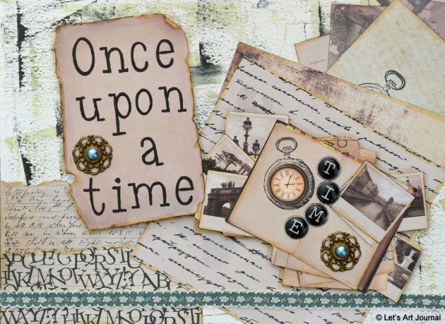
To portray the old building I wanted to create a vintage page with a grunge background, so I started by applying white gesso to the page with an old gift card and leaving it to dry. Once dried, I added Black Soot Distress Ink by applying the ink pad to an acrylic block and picking up the ink with the gift card and scraping the ink across the page. I used the same technique to add Peeled Paint Distress Ink which I diluted with some water on the acrylic block to tone down the colour a little. Next I created a collage on the page, using a collection of papers from Vintage design pads by Craft Sensations, which reminded me of the museum, art gallery and library that we visited. These papers included some lined paper which I stamped with a Script stamp and an Alphabet stamp, both by Kaisercraft, using black Archival Ink and then I stuck them to the bottom left-hand side of the page using a UHU Stic. Like all of the papers, I edged them with a Desert Spectrum Aqua marker and a black Derwent Graphik marker to give them more definition. I also fussy cut different paper images and layered them on the top right-hand side of the page and on one of these papers I stamped a clock image from a Steampunk stamp set by Docrafts using black Archival Ink. I used the same clock stamp for the top paper which details an open book and photos, and I added a vintage clock die-cut shape to the centre of the stamped image using double-sided foam tape. The photo images remind me of the art gallery and also the grandeur of the building as well as the lamp posts that we saw at its entrance. I stamped black circles alongside the clock using a cap from a spray bottle and black Archival Ink, and then inserted the black button letters to spell out the word “Time” which along with the clock images reminds me of the pendulum clock situated in the central hall/atrium. I mounted these elements onto white card and stuck them to the page using double-sided foam tape. Next I stamped the words “Once upon a time” onto another piece of paper using black Archival Ink and an Alphabet stamp set by Papermania; this applies to the library books, the museum history and the artworks in the gallery. Then I mounted it on white card, fussy cut the page out and distressed the edges using scissors. I edged it with black Faber-Castell Big Brush marker as well as the Desert Spectrum Aqua marker and stuck it to the page using double-sided foam tape. To finish, I added a pretty piece of antique looking ribbon and two vintage metal embellishments.

The Harris building dates back to 1893 and was built in an imposing neo-classical design. The main feature of the front of the building is the pediment which houses a sculpture representing “The School of Athens” and a number of griffins guarding the lamp of learning on the apex. Beneath the pediment is the inscription “To Literature, Arts and Science” which reflects the purpose of the building.

Rather than have a set of front steps leading directly into the building from what was the busy Market Square there are two entrances on either side of the building which lead to a covered entrance with beautiful lamp posts.

The main feature of the interior is the impressive central hall which rises through four storeys over 120 feet to the lantern tower.  The mosaic floors and columns also reflect classical influences from Ancient Greece and Egypt. As part of the design there are plaster copies of Classical and Renaissance sculpture to illustrate the “whole range and history of the world’s greatest achievements in art” and a number of these classical friezes can be found throughout the central atrium along with a 19th-century copy of the Baptistery doors from Florence.

The museum has a permanent history gallery called “Discover Preston” and features collections including archaeology, ethnography and local history. The museum houses the “Poulton Elk” which is very well-known around here as it was found under a bungalow in the 1970s! The skeleton is intact and has an arrowhead embedded in its leg, and as it is over 13,500 years old it’s the earliest evidence of people living in the Northwest of England. I was excited to see it, although I know this animal as a Moose from visiting America, apparently we call them Elk over here in the UK which surprised me (grin!).

The staircase is magnificent too, here is the view from the Gallery area with the beautiful Greek and Assyrian friezes, soft pink walls, amazing artwork, marble, sculptures and mosaic floors.

The gallery houses a number of contemporary and classical artworks as well as photographs.

This is the view from the Art Gallery floor down to the Museum floor and the Central Hall.  You can just make out the Foucault pendulum on the lower floor on the right-hand side of the picture. It hangs in the central foyer, through all the floors, over a butterfly-shaped plate marked with the hours of the day. As a result of the rotation of the Earth, this functions as a decorative and reasonably-accurate clock. It’s a spectacular view and was certainly a long way down (grin!).

As usual I also had fun creating a page that incorporates a number of blog challenges too; which I always enjoy as they are a fantastic source of inspiration.

I’m pleased to join Yvonne from Meggy’s Way who is hosting the “Colour in my World” challenge over at Art Journal Journey because at the library we were greeted with neutral and soft colours like you can find on my page.

Over at Try it on Tuesday their theme is “Time or Clocks” so I’m pleased to be able to join in their fun as I added references to both of them onto my page.

I’m also joining the “Anything Mixed Media Goes” challenge over at Mixed Media World with my library inspired page.

As I added the metal embellishments, I’m pleased to join “Heavy Metal” challenge over at the Simon Says Stamp Monday Challenge.

I’m also entering my vintage inspired page in the “Vintage” Challenge over at The Mixed Media Challenge.

Thanks for joining me today! If you have any questions or comments, I would love to hear from you.

Here is a list of all the materials used to create this art journal page:

  • Pébéo White Gesso
  • Tim Holtz Distress Ink (Black Soot, Peeled Paint)
  • Ranger Archival Ink (Jet Black)
  • Spectrum Aqua Artist Marker (Desert)
  • Derwent Graphik Line Marker (Black 0.05mm & 0.8mm)
  • Faber-Castell Big Brush Pitt artist pen (Black 199)
  • Kaisercraft clear stamp (Script CS752, Alphabet CS887)
  • Docrafts Creativity Essentials A5 clear stamp set (Steampunk DCE907125)
  • Papermania Alphamania A-Z stamp set (Leftovers Alphabet PMA9071102)
  • Craft Sensations Design Pad (Authentic Vintage CRO730/R, Travel Memories 154898, Classic Vintage CRO707/TW7, Vintage Romance 154897)
  • White card
  • The Works M&C Boutique (Vintage Die Cut Shapes)
  • Poundworld Décotime (Vintage Metal Stickers 54748)
  • Poundworld Craft Corner (Adhesive Ribbon U-80933)
  • Home Bargains Love Letters (Self-Adhesive Button Letters 22738)
  • UHU Stic
  • The Range double-sided foam tape


Friends

I enjoyed creating this page and would like to dedicate it to three of my best friends who are going through hard times at the moment.

Having only the quote in mind, I sought inspiration for my page from some great blog challenges that I wanted to join. I always find that these challenges really capture my imagination and I have such a fun time incorporating them all into my design, and this page was no exception (grin!).

I started by colouring the background with Faber-Castell Gelatos; I did this by scribbling Bubble Gum, Orange Soda and Lemon gelatos onto my page and then smudging them with my finger. These bright colours make me happy as they remind me of some flowers that were bought for me recently so they are perfect for Yvonne‘s theme of “Colour in my World” over at Art Journal Journey. I kept the gelatos thick for the next technique, where I used a baby wipe through two different stencils to remove some of the gelato colour.

I like the way the bubbles and crosses are twinkling over the page and to enhance this look I added some Wink of Stella clear glitter to each bubble, which was inspired by Monday’s “Shimmer and Shine” challenge over at Simon Says Stamp. Next I stamped the heart and circle design by Sugarloaf Inc. using black Archival Ink, I love this stamp it’s one of my favourites. Then I added more shiny elements in the form of Designer Vinyls by Craftime which have a black high gloss finish and detail intricate designs of friends at play. These images were inspired by the “My Friend” theme over at Try it on Tuesday and works perfectly with the quote. I printed the word “Friends” from my computer, fussy cut the letters out, coloured them black with a Faber-Castell Big Brush marker and stuck them to the page using a UHU Stic. They are outlined with Dovecraft black Pearl Effects and more shimmer was added to the centre of each letter using the Wink of Stella glitter brush. Then I used an alphabet stamp set from Docrafts with black Archival Ink, to stamp the rest of the quote, which reads:

“Friends fill your life with joy, your soul with sunshine and your heart with love”.

I added more shimmer and shine using some pretty glitter butterflies from Poundland and also some glossy hearts and flowers from the same Designer Vinyl set. Then I stamped a border by Hampton Art around the edge of the page using the black Archival Ink and added the neon orange border over the top which is from a pack of 3D Border Glitterations by Docrafts Papermania; I really like the glitter effect and their transparency as you can still see the stamped border beneath them. To finish, I added a black Glitterations border on the inner edge of the orange border to frame the page with a sparkly black line too.

Here are the beautiful flowers that coloured my world, they were a gift from a family member who stayed with us recently, I chose similar colours for my page as they make me so happy when I see them – aren’t they stunning!

I love creating my art journal pages using mixed media so I’m also pleased to join the “Anything Mixed Media Goes” challenge over at Mixed Media World.

I also really enjoyed incorporating some of my favourite stamps for the background, border and quote on my page, and taking inspiration from Majo who used quotes on her artwork over at Craft Stamper, I thought it would be fun to join their “Anything Goes” Stamping Challenge!

Thanks for joining me today! If you have any questions or comments, I would love to hear from you.

Here is a list of all the materials used to create this art journal page:

  • Faber-Castell Gelato (Bubble Gum, Orange Soda, Lemon)
  • Ranger Archival Ink (Jet Black)
  • Faber-Castell Big Brush Pitt artist pen (Black 199)
  • Zig Memory System Wink of Stella Brush (GL Clear 999)
  • Dovecraft Pearl Effects (Brights – Black DCBS92PD)
  • Uni Posca Paint Pen (Black)
  • Uni Pin Fine Point Marker (Black 0.3mm)
  • Craft Sensations (Deco Stencil Set 154892)
  • Anita’s Sugarloaf Inc. wood mounted rubber stamp (26645)
  • Docrafts Creativity Essentials A5 clear stamp set (Alpha Folk DCE907115)
  • Hampton Art Doodlebug Inc. cling mounted rubber stamps (Borders ICO160)
  • “Friends” computer printout
  • Craftime Designer Vinyls (B/W Boy & Girl PBDV02)
  • Poundland (Mini Glitter Embellishments 59409)
  • Docrafts Papermania Glitterations 3D Borders (Neon Orange PMA818103)
  • Docrafts Papermania Glitterations (Black Borders ANT8181015)
  • Ranger Glossy Accents
  • UHU Stic
  • UHU Glue Pen

Aspire

Today I’m sharing another page inspired by my trip to Blackpool Central Library, and this time I have taken another one of the fabulous stained glass windows that depicts the word “Aspire” as my inspiration. My design includes the arrows and words that can be found etched into the window design, as well as the meaning of the word “aspire” which was cleverly defined through the images that can be seen on the window.

I started by stamping a cog image from a Steampunk stamp set by Docrafts using black Archival Ink to create clusters of cogs. I then used the same ink to stamp a series of arrow stamps by Hampton Art; this replicates the arrows pointing upwards that were etched on the window panes. I also added diagonal stripes to the largest arrows that I had stamped using a black Uni Pin marker to further match the etched glass design. Next I painted diluted Fawn and Topaz Spectrum Aqua markers onto the page, by scribbling the ink onto an acrylic block, spritzing it liberally with water and then applying it to the page with a paint brush. I gradually built up the colour so that it was more concentrated around the edges of the page. I like the way the clean finish of the background mimics the transparency of the glass window.

To give a metal look to the cogs that I had stamped, I coloured them with Fawn, Topaz, Desert and Chestnut Spectrum Aqua Markers. Then I added Ranger Glossy Accents to the cog and arrow images that I had stamped to give them some dimension so that they appear like glass shining from the page. Whilst the Glossy Accents was drying I created this card to depict the word Aspire and the meaning of it that can be derived from the window itself. I used a card by Docrafts Papermania which I cut to size and coloured the dark blue elements of the pattern black using black Sharpie and Uni Pin markers. I took an old dictionary and cut the page containing the word ‘aspire’ and glued it to the front of the card and also to the inside using a UHU Stic. Then I covered both pieces of dictionary text with a thin layer of gesso, aged it with Tea Dye Distress Ink using a blending tool and distressed the edges using the Fawn and Chestnut Spectrum Aqua Markers smudging the ink with my finger to give a vintage look. I stamped the word “ASPIRE” onto the front using a Docrafts alphabet stamp set and black Archival Ink.

Then I also added the definition from the Collins dictionary onto the inside of the card using an alphabet stamp set by Dovecraft and the same black ink. To finish the card I added some pretty coloured rub-on transfers by Kaisercraft to the front and inside of the card which reminded me of stained glass window designs, and then I stuck it to the page using double-sided tape. I also added the hot air balloons which are also rub-on transfers and the saying “Up, up and away” to symbolise the word “Up” that was etched on the glass and also the space rocket lifting off on the window design. To compliment the images I had stamped and to accentuate the illusion of upwards movement, I added black lines of Glitterations stickers and copper gemstone borders to draw the eye upwards. To finish, I embellished some of the stamped cogs with bronze gemstones to add more sparkle and edged the page with a black Faber-Castell Big Brush marker.

As you may have discovered in my two previous posts, which you can find here and here, this library dates back to 1911. In 2011 to mark the centenary the interior was refurbished and eight new stained glass windows were installed. Here is the beautiful “Aspire” window which inspired my latest page.

Having used these beautiful natural colours as well as different mixed media on my page, I’m pleased to be able to join Yvonne from Meggy’s Way for her “Colour in my World” challenge over at Art Journal Journey and the “Anything Mixed Media Goes” challenge over at Mixed Media World.

With the metal cogs and copper gems, I’m also pleased to join the “Metal” theme over at Country View Challenge.

I’m pleased that the clean finish and simplicity of my design also fits the “Clean and Simple” challenge over at Simon Says Stamp Wednesday Challenge.

I really like the steampunk feel that I created too, so I’m joining in the fun over at SanDee and amelie’s Steampunk Challenges with their “Anything Goes – Steampunk/Industrial” theme.

I enjoyed using all the different stamps to create this page, so I’m also pleased to be able to join the September Challenge of “Anything Goes: (must include stamping)” over at Craft Stamper.

Thanks for joining me today! If you have any questions or comments, I would love to hear from you.

Here is a list of all the materials used to create this art journal page:

  • Ranger Archival Ink (Jet Black)
  • Spectrum Aqua Artist Marker (Fawn, Topaz, Desert, Chestnut)
  • Faber-Castell Big Brush Pitt artist pen (Black 199)
  • Sharpie Fine Point Permanent Marker (Black)
  • Uni Pin Fine Line marker (Black 0.5mm)
  • Pébéo White Gesso
  • Tim Holtz Distress Ink (Tea Dye)
  • Hampton Art Bella Blvd cling mounted rubber stamps (Sand & Surf ICO226)
  • Docrafts Creativity Essentials A5 clear stamp set (Steampunk DCE907125, Alpha Trad DCE907116)
  • Dovecraft Essentials Alphabet Stamp Set (WDN ALPHA STMP DCVW0050)
  • Docrafts Papermania Mini Cards & Stamp Set (Capsule Geometric Krafts PMA105308)
  • The Oxford Pocket Dictionary
  • Docrafts Glitterations (Black Borders ANT8181015)
  • Kaisercraft Rub-ons (Up, Up & Away collection RB870, Lush Collection RB868)
  • Docrafts Forever Friends Opulent (Adhesive Dome Borders FFS351111)
  • Ranger Glossy Accents
  • UHU Stic
  • X-Press It double-sided tape

Freedom

Last week we went to the Blackpool Central Library which dates back to 1911 and was built in the Edwardian Baroque style. I was so inspired by the wonderful architecture and the fabulous interior that I have a few pages that I want to create. This is my first page and is inspired by one of the stunning stained glass window designs that can be found in the library.

Inspired by the window colours and design, I added Gold, Kingfisher and Aquamarine Spectrum Aqua Markers to the page by applying them onto an acrylic block, spritzing with water and then pressing the block onto the page. I also dripped the ink from the acrylic block onto the page too. I love the intensity of the colours and how they have layered and merged together. Next I added splatters of black acrylic paint using a paintbrush. Then using black Versafine Ink and an alphabet stamp set by Papermania I stamped the word “Freedom”, which is detailed on the window and is stamped in the same shape as the window design. I applied black Papermania embossing powder over the top of the ink and then shook the excess powder onto a piece of scrap paper tapping the page against the table to remove any stray powder; I didn’t take too much care in removing the embossing powder as it adds to the grunge look. Once the excess powder was safely returned to its container, I used a heat gun to melt the embossing powder. I swept the gun over the letters, taking care not to direct the heat in one area for too long until the embossing powder changed to a glossy finish becoming smooth and dimensional. I like the way the letters stand out from the background as it looks a bit like the lead of the stained glass. To replicate some of the detail found at the top of the window, I used the same alphabet stamp set to add random black embossed letters to the top and bottom edges of the page using the same technique.  I also secondary stamped some of these letters using the black Versafine ink and then stamped them again using the Spectrum Aqua markers to create a layered look. As a butterfly was part of the window design, I stamped a Vintage-Cherish butterfly image and also a doily stamp, both by Kaisercraft, using the black Versafine Ink. Then I used Glitterations outline stickers to add the black lines and blue gems to add some sparkle which reminds me of the light shining through the glass. For the butterfly, I fussy cut the image from a doodle book, changing the shape slightly. Then I coloured in the zentangle patterns using yellow, light blue, black and white Uni Posca paint pens and stuck it to the page using double-sided tape in the centre and double-sided foam tape to raise the wings and create a 3D effect.

The beautiful colours on my page link to Yvonne from Meggy’s Way‘s theme of “Colour in my World” over at Art Journal Journey.

And the vintage look links to the “Vintage” theme over at The Mixed Media Challenge.

My page also matches the combination of colourful yellow and peacock feather images from the moodboard over at Mixed Media World so I’m joining in their “Anything Mixed Media Goes with Moodboard ” challenge.

As I created this page using lots of stamp images, I’m also linking to the “Stamp It” theme over at the Simon Says Stamp Monday Challenge.

The Central Library in Blackpool is quite an imposing building being constructed of Accrington red brick with stone dressings and beautiful columns on each side of the doorway. You can see the words “Central Public Library” carved above the doorway and at the very top there is an octagonal leaded dome.

The interior was renovated in 2011 marking the centenary of the building and this included installing some beautiful stained glass windows. This is window that inspired the ink splatters, “freedom”, letters and butterflies on my page design.

It was such a beautiful place that provided me with so much inspiration that I plan to create a few more journal pages which I’ll be sharing with you along with some photos of the interior next week so watch this space.

Thanks for joining me today! If you have any questions or comments, I would love to hear from you.

Here is a list of all the materials used to create this art journal page:

  • Spectrum Aqua Artist Marker (Gold, Kinngfisher, Aquamarine)
  • DecoArt Crafter’s Acrylic (Black)
  • Tsukineko Versafine Ink (Onyx Black)
  • Papermania Embossing Powder (Black PMA4021006)
  • Kaisercraft clear stamp (Vintage-Cherish CS831, Doily CS297)
  • Papermania Alphamania A-Z Clear Stamps (Leftovers Alphabet PMA9071102)
  • North Parade Publishing Ltd (Suduko & Doodles Animal Kingdom)
  • Docrafts Glitterations (Black Borders ANT8181015)
  • Home Bargains (Gem Jewels 63283)
  • X-Press It double-sided tape
  • The Range double-sided foam tape