
Over at Try it on Tuesday our challenge for the next 2 weeks is Falling in love.
I’m celebrating falling in love with my romantic shabby chic page using a gorgeous Shabby Chic paper from Studio Light and some very delicate green voile butterflies that my sister kindly gifted me for Christmas (grin!). I hope you like it and are inspired to join our challenge too; it would be lovely to see you there!

Keeping the background colours soft and elegant, I started by lightly painting some Rose Madder, Burnt Sienna, Yellow Ochre and Turquoise blue Kuretake watercolours onto the page. Then I used a Lace stencil from Tim Holtz to apply some Picked Raspberry Distress Ink and a Moroccan Stencil from Creative Expressions to apply some Speckled Egg Distress Ink; both inks were applied using a blending tool. Next I stamped a Gothic Book stamp from Finnabair, which is one of my favourite stamps, and also a delicate Floral Icons stamp from Docrafts using Toffee Crunch Memento Ink.

I cut the Shabby Chic paper to create the different paper pieces including some tags which I die cut using a Tag Collection Framelits die set from Tim Holtz. They were all edged with Vintage Photo Distress Ink and then I arranged them onto the page using double-sided tape. I used Kaisercraft stickers for the wording and I tied some green thread to the tags to match the colour and delicate nature of the butterflies. The metal copper embellishments were held in place using Ranger Glossy Accents; they included a framed picture of the Tower of Pisa, a heart and a love letter envelope.

I used glue dots to stick the delicate green voile butterflies in place and then I added some sparkly green gemstones to the butterflies, metal embellishments and paper pieces which finished the page.
For more inspiration please pop over to Try it on Tuesday and take a look you at the wonderful Falling in Love creations from my Design Teamies too (grin!).

We love Italy and have visited Pisa whilst travelling to Tuscany; the Tower of Pisa was a sight to behold with its four-degree lean which is due to unstable foundations.
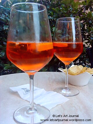
As T Stands for Tuesday, here are a couple of glasses Aperol Spritz; it’s a refreshing drink that we always enjoy whilst in Italy! Aperol is an alcoholic Italian aperitif which is bitter in flavour. In this case it has been mixed with prosecco and a splash of soda water then served with ice and a slice of orange – Happy T Day!
Hope that you’re all staying safe and well!
Thanks for joining me today! If you have any questions or comments, I would love to hear from you.
Here is a list of the materials that were used to create this art journal page:
- Kuretake Gansai Tambi Japanese Watercolour Paint set (Rose Madder, Burnt Sienna, Yellow Ochre, Turquoise Blue)
- Tim Holtz Layering Stencil (Lace THS034)
- Tim Holtz Distress Ink (Picked Raspberry, Speckled Egg, Vintage Photo)
- Creative Expressions That Special Touch of Mica Masks (Moroccan)
- Finnabair Clear Stamp (Gothic Book #966966)
- Docrafts Creativity Essentials A5 Clear Stamp Set (Floral Icons DCE907123)
- Tsukineko Memento Ink (Toffee Crunch)
- Studio Light 12×12 Paper (Shabby Chic SCRAPSC03)
- Tim Holtz Sizzix Framelits (Tag Collection 658784)
- X-Press It! double-sided tape
- Kaisercraft Sticker Sheet (Everlasting SS376)
- Guterman Thread (Col. 763)
- The Works (Metal Framed Embellishments)
- Crafter’s Companion Parisian Collection (Metal Charms S-PAR-CHAR)
- Ranger Glossy Accents
- Green Voile Butterflies
- Stix2 glue dots
- Hero Arts Gemstones (Green & Red CH120)
| Challenges I’m pleased to join the lovely Valerie over at Art Journal Journey and her Heavy Metal challenge this month with the metal embellishments that I included on my page. I’m so happy to join in the fun over at The Funkie Junkie Boutique Challenge Blog and their So Delicate challenge with my delicate and romantic shabby chic page. I’m joining the LTSCB #142 – Love is … challenge over at Love To Scrap Challenge Blog with my love-themed art journal page. I’m also pleased to be able to join Simon Says Stamp Monday Challenge and their Love and/or Hearts challenge as my romantic page contains both. I’m also joining the Anything Goes challenge over at Simon Says Stamp Wednesday Challenge too. |

Hi Jo, love your old fashioned and romantic page, wonderful colours, too. April Spritz is good! Have a great week and a happy T Day, hugs, Valerie
LikeLiked by 1 person
Beautiful color combinations and soft images ~ look like a vintage diary ready for a love story to be written on the page 🙂 Enjoy your week!
LikeLiked by 2 people
Aperrol spritz sounds like a very delicious drink, especially if you could manage to be in a nice outdoor café on a tree-shaded plaza in Italy. Don’t we wish…?
be well… mae at maefood.blogspot.com
LikeLiked by 1 person
A beautiful, romantic page Jo! I love the butterflies.
Hope you’re having a good week.
Alison xx
LikeLiked by 1 person
This is such a wonderfully romantic page Jo. Adding the Tower of Pisa makes me think that this couple is off on a romantic adventure and the sights are only part of the story. Smile. Gorgeous piece. I haven’t made it to Pisa yet (Rome, Florence and Naples only), but when I go I shall try an aperol spritz. I do remember how the choices of wine were so much less than I expected, but maybe we just have too many choices here. Thanks for joining Valerie’s challenge at AJJ, and hope your T day is going well. Hugs-Erika
LikeLiked by 1 person
Such a beautiful page Jo – the papers are beautiful, especially used in this way! I see we both have thoughts of Italy. I still haven’t been to Pisa so we may just have to go back, although the lovely travel firm we used to use has sadly ceased to trade since September. I’ve never tried Aperol Spritz either…so another reason…just want to know when now!!! Happy T day, Chrisx
LikeLiked by 1 person
What a lovely romantic page (a bit too early for valentine’s day). I marvel at those green butterflies. Gorgeous.
You know, I have lived in Italy for 15 years or more and I have never been to Pisa. (I lived in Abbruzzo, so it was rather a long way away).
But I love Aperol, as well as other bitter drinks like Gingerino and Campari, and the amaro liquors like Cynar. We even have a bottle of Fernet Branca in the drinks cabinet for medicinal purposes (indigestion).
Happy T-Day,
Hugs,
Lisca
LikeLiked by 1 person
A very vintage and romantic page. Lovely! I really like the images and the butterflies.
The leaning Tower of Pisa is a place I would love to visit. Maybe someday. It looks like you have great memories of your visit.
Happy Tea Day,
Kate
LikeLiked by 1 person
Lovely journal page…very romantic
LikeLiked by 1 person
Romance for February 🙂 Sweet.
Someday I’ll try the Aperol Spritz. It looks so pretty. Happy T Tuesday!
LikeLiked by 1 person
Hi Jo! This is such a delicate looking piece of art. I love it. You have made the, love is in the air. very prominent. Have a wonderful day.
LikeLiked by 1 person
Stunning vintage art journal spread Jo! LOVE that paper you used! So very pretty! Have a super week! ((HUGS)) Helen
LikeLiked by 1 person
such a beautiful and romantic page jo! I love those translucent butterfly images. I saw the Pisa tower but only from the train window when passing through. Wish my friend and I would have taken the time to stop and see it…such a beautiful country isn’t it. I’m thinking I need to get some Aperol and make these spritzes when we can finally celebrate spring;) Cheers, and happy T day!
LikeLiked by 1 person
Your page is pretty and reminds me of a Victorian parlor. I’ve never been to Italy but the picture of the Leaning Tower is welcome as there’s no snow on the ground! Happy T Day
LikeLiked by 1 person
Gorgeous page! Love the vintage feel!
LikeLiked by 1 person
Thanks so much 😀. I hope you’re having a lovely week, Happy February! Hugs, Jo x
LikeLike
I can almost hear the violins playing! What a great, feminine, romantic, vintage page! I love the mix of the soft pink papers with the touches of the most beautiful green of the butterflies, threads and Tower of Pisa embellishment. Your sister spoiled you with those butterflies! And thanks again for spoiling us with your artwork in our So Delicate challenge at The Funkie Junkie Boutique challenge blog!
LikeLiked by 1 person
A gorgeous romantic page Jo. The butterflies are beautiful.
Stay safe.
Yvonne xx
LikeLiked by 1 person
That is so fantasic romantic page!!!
I love the idea! Great Pisa photo!
Hugs Elke
LikeLiked by 1 person
Jo you’ve done it again with another superb delicate layout. The tags and postcards lead the eye around the page and back in such a clever way and the soft colours are so soothing. Thank you for sharing it with us at The Funkie Junkie Boutique Blog xx
LikeLiked by 1 person
A lovely soft romantice page Jo, beautiful design with those pretty papers and butterfly.
Have a great week.
Avril xx
LikeLiked by 1 person
Super lovely, Jo, and sooooo romantic. I love the words: “It was always you.” They just have such special meaning. The butterflies and watercolor are such pretty touches.
I am so jealous you have visited Italy and know so much about it. The drinks look and sound refreshing. Beautiful stuff here.
LikeLiked by 1 person
I know I’m late, but I think I felt better Tuesday than I do today. My jaw dropped when I saw this beauty. I’m always amazed at how you find ways to incorporate your art and your love of your husband at the same time. I can tell it’s genuine, too. I really like how you incorporated the Leaning Tower of Pisa in the spread in order to show how you saw it in years past. This is SO clever. I’m also delighted you shared this with us at Art Journal Journey, too.
Your Aperol Spritz sounds like something you and your husband would order while in Pisa. Thank you so much for sharing this with us this week for T. Again, I’m sorry to be so late visiting.
LikeLiked by 1 person
Lovely page Jo, love the soft colours
Joan
LikeLiked by 1 person
This is full to the brim with romance Jo, the green voile butterfly is spot on in colour to bring out that Toffee crunch edge (always makes me want Toffee when I read those words :D) Lovely to see you bring the Tower of Pisa into your page, beautiful addition. I’m not sure I have the energy to even think about romance right now but i’ll try and join in this fortnight if I can get my crafty mojo back up and running. Hugs Tracey xx
LikeLiked by 1 person
Those green voile butterflies and so pretty and such a great addition to your lovely romantic page. I love shabby chic, don’t do it well bukt admire seeing it like just now.
The images you have chosen to use are perfect for this and work so well against that lovely background you have made. Rose Madder, takes me back awhile I have not heard of that colour in a long time but coupled with the other colours (Toffee Crisp sounds lovely) it makes a beautiful backcloth for your images. you have used them so lightly that the background is almost ethereal. Another very successful page.
Hugs, Neet xx
LikeLiked by 1 person
Lovely and very romantic page, I like this.
Have a nice week!
LikeLiked by 1 person
Stunning shabby chic/vintage page Jo, I love the soft colors and beautiful papers you used!
Hugs, Tammy
LikeLiked by 1 person
Hi Jo, I’m 9 days behind so I’m catching up here. Now, this lovely collage is what I think of as proper British. Very traditional and vintage and in excellent taste! It’s very nice ! XOX
LikeLiked by 1 person
Back with my DT hat on, still ogling over this page! Thanks so much for sharing with us over at Love To Scrap Challenge Blog this month! We appreciate you joining us!
Hugs,
Leslie, LTSCB DT
Love To Scrap 2
LikeLiked by 1 person